Are you Ready to Pop? A Comparison Between the Colorshifting Films of the LomoChrome Family.
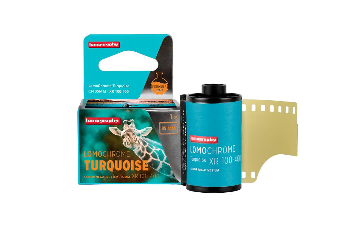
4 16 Share TweetLomoChrome films are synonymous with audacious and irreverent color schemes. With the glorious comeback of the LomoChrome Turquoise Film, let's jump into this review and find out how the LomoChrome Metropolis, LomoChrome Purple and LomoChrome Turquoise perform! Once you master the color-shifting eccentricity they retain, each of them will serve your purpose and fit your style.


Work With the Light
The key to appreciating color shifts in the LomoChrome film family is to choose a bright day. These films will give you great results in direct sunlight. Shooting on an overcast day is not recommended. This is because the missing effects from the sunrays don't help the film’s performance. Shooting between ISO 100 and 200, your grain will be at its finest.
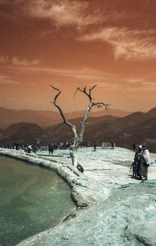
As shown in examples two and three, the shifting yellows in the sky of the LomoChrome Turquoise are lighter at ISO 100 and we can perceive a milder green tint, while at ISO 400, we can appreciate deep and full emerald tones. At ISO 100, as we can see clearly on Vienna's St. Stephen’s Cathedral which is not in direct sunlight but in the shadows, the shifting of blue tones tends to be a lighter shade of azure. With the higher setting ISO 400, there is a dramatic increase in yellow tones verging on sepia and shades of orange, and slightly more visible grain.
It is worth noticing that in a higher ISO setting, LomoChrome Turquoise and LomoChrome Metropolis have a strong contrast in the dark areas; while the LomoChrome Purple has a softer contrast, which can make it a favorite for portraiture work.


Once you have established the best weather conditions to shoot with the film, there are no limits to their use and it all depends on the kind of projects you have in mind. The important thing is to be aware of the general color shifts, so you can determine how to best use your LomoChrome film. At first glance, we could easily say that the LomoChrome Turquoise is best suited to landscape and architecture photography. However, it's not fair to this film to give those limitations and stereotypes – it's important to experiment to find out your own preferences.
Color Shift
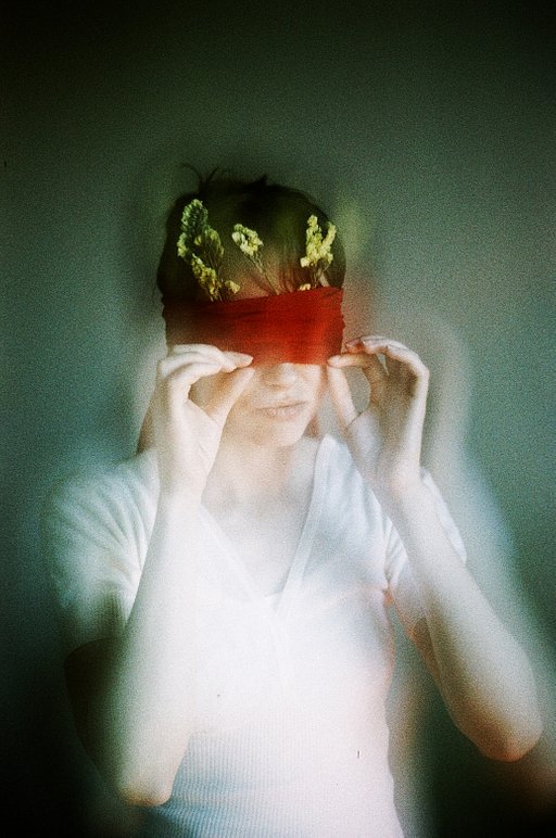
Each film has its peculiarity. In the LomoChrome Turquoise, the yellows graciously shift in the dark areas towards a saturated deep sepia, to more goldish shades in the light parts – this is especially visible at ISO 400. There are also opulent green tints with emerald tones: the result is gorgeous. At ISO 400 the distinctive range of colors is apparent in the skin texture, with the appearance of saturated tones. In shading from darker to lighter areas, we can appreciate the turquoise parading all his glory.


The combination of colors in the LomoChrome Purple formula is quite harmonious. Green and yellow shift to Purple, allowing astounding deep violet tones all over your picture. Already at a low ISO, the color shift is refined. How wonderful it is to find a familiar green tint paired with such delightful shades?
Even with contrast increasing at ISO 400, we do not get overwhelmed with this film’s power. It allows for a good range of detail in the shadows, as shown in examples one and five. It must be noted that in overcast conditions, as shown in example 4, the colors do not render equally well.


If the LomoChrome Purple and LomoChrome Turquoise are so audacious, the LomoChrome Metropolis could be seen as the shy family member with a less obvious color-shift.
However, you would be mistaken if you underestimate the great possibilities hidden within this film! Cold-ish and stern at ISO 400 with harsh contrast, as seen in example 1; it can be delicate and gentle on your subjects with only one stop difference at ISO 200, as seen in example 4, where the desaturated tints give an allure of ethereal magic mystery.


When the sky is the limit, it is impressive to know that you could have three different ways to look at it! Create abstract photography with out of this world landscapes. Or popping portraits, where skin tones are realistically unapologetic. Dare to create a world where your ideas flourish and expand at every click you take. You'll be mesmerized by the unexpected results you will have in your hands and experience an incredulous, jaw-dropping moment.
Have you already ordered your rolls of LomoChrome Turquoise? Which one of the LomoChrome family is your favorite film? Share your thoughts with us in the comments below!
written by eparrino on 2022-03-17 #gear #color-shift #lomochrome-purple #lomochrome-turquoise #lomochrome-metropolis #lomochrome-family #lomochrome-comparison #iso-comparison


4 Comments