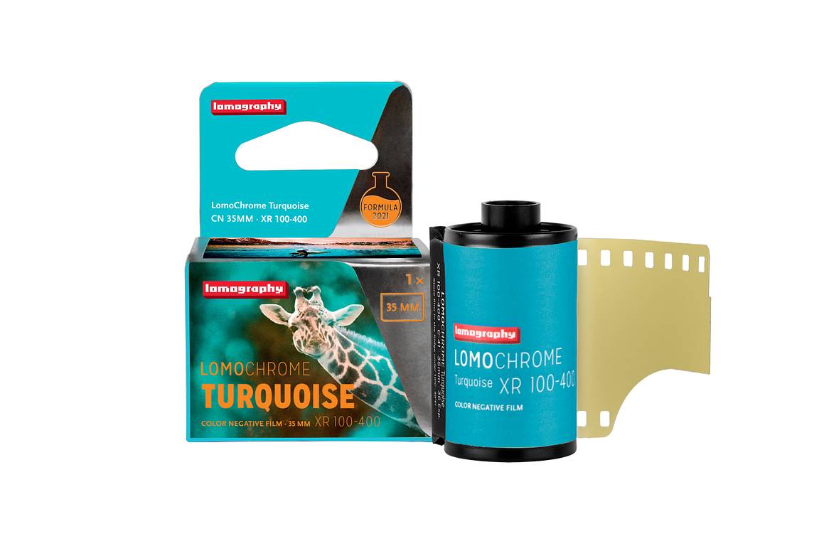
LomoChrome Turquoise Review by @hodachrome
6 30 Share TweetIn the fall of 2022, LomoChrome Turquoise XR 100-400 was revived in response to fan requests. Many Lomographers were delighted with the return of this unique and popular LomoChrome film, including @hodachrome.
The Japanese photographer and master of experimental photography is a big fan of this unique film, so much so that he kindly wrote this review giving us his impressions of the new LomoChrome Turquoise, and including his own stunning images taken with the film. Please read and enjoy hodachrome’s review below!

Film specifications
Name: 2021 LomoChrome Turquoise ISO 100–400
Type and variation: Color negative film (C-41 process), 35 mm and 120 available
Sensitivity: ISO 100-400
(More details can be checked on the product page of the online shop or LomoChrome Turquoise Film Guide )
Photo Samples

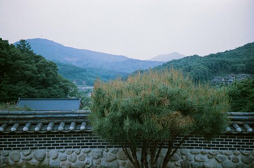
The biggest characteristic of this film is that "yellow turns blue". Yellow pampas grasses turned blue according to the film's rule. But not turquoise blue because grasses are not bright yellow. The red autumn leaves in the background have turned bluish-purple.
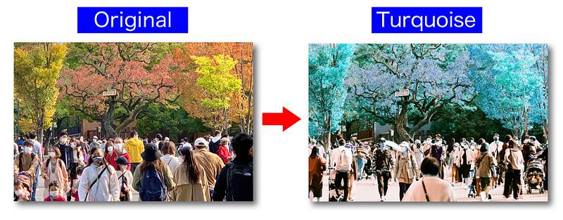
Here the bright yellow leaves turned turquoise blue and the red leaves turned bluish purple. The green leaves meanwhile turned an emerald color or blue-green. People's skin changed to a dull blue "zombie" color. The colors of people's clothes also changed according to the rule, and the highlights tend to have a slight orange tint.

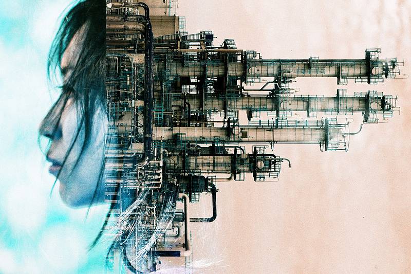
The portrait examples may be a bit confusing because of the multiple exposure element, but there should be no problem in checking the skin color of the face. In these examples people's skin changed to dull blue color. If you make good use of this zombification characteristic, you can take really unique photos!

Flamingos, which are usually characterized by bright pinks, reds or oranges, turned into an unhealthy bluish-purple with the magic of this film. I've also tried with giraffes, wallabies, elephants, lions, etc., and they all have unique results.

The red/orange sunset changed to a strong turquoise blue, and the blue sky changed to orange. It is as if the color balance is reversed. This gives a unique atmosphere so you can create interesting photos depending on your ideas and subjects.

Various light sources are mixed in this factory night scene. The blues and greens were emphasized by the film. Incandescent lights turned blue, while fluorescent lights turned green, and they seem to be mixed together. Due to the long exposure, the orange of the sunset sky didn’t turn blue but white.
Comparison by sensitivity


I took three shots of the same subject at ISO 100, 200, and 400. At ISO 100, the sky is slightly white, and at ISO 400, the dark areas of the leaves are black. Checking these images and the developed negative, ISO 200 seems to be the standard setting, like the previous version of LomoChrome Turquoise. However you should of course change the settings or adjust the exposure for your own personal taste.
Impressions
Saturation
The saturation (color intensity) seems generally a bit lower than with the previous version of this film. I remember for example the sky blue was a more vivid orange. The brightness of the turquoise blue color remains the same.
Contrast
The contrast is neither too soft nor too hard, and gives a smooth gradation. I felt the shadow tone is nicely black.
Grain
The graininess is not much different from the previous version, or perhaps slightly rougher. If you make a large print for exhibition or sale, the grain will be noticeable, but I can say it is definitely relatively smooth.
Sensitivity
ISO 200 seems to be the standard (proper exposure) setting, but you should change it depending on the conditions of the subjects and your purposes. Any range from ISO 100 to 400 is perfectly usable.
Overall Impressions
This version of LomoChrome Turquoise faithfully follows the characteristics of the previous version, but the tone of the color seems calmer and softer in general. It may be unsatisfactory for those who seek strong individuality but will be more suitable for those who want to use it for a wide range of purposes. Yet, I feel the strength of the film's uniqueness remains unchanged. I personally prefer the new version because I can use it more widely in various kinds of photographic scenes. It is worth noting that color tones, contrast, etc. will change depending on the varied development and scanning conditions.

Here's a simple illustration showing the color change. I hope this chart image will be helpful for you. Note: The color will change depending on the amount of exposure, how the light hits, how it is scanned after development, etc.
Finally, I would like to show a few of my other works with this film. LomoChrome Turquoise is a limited release, so get some while you can and take fun photos with your own style!


Thank you to hodachrome for sharing his insights! Check out his LomoHome for more of his photography. 2021 LomoChrome Turquoise ISO 100 - 400 film is now available in 35 mm, 120 and 110 formats.
written by hodachrome on 2023-05-04 #gear #people #review #color-shift #first-impressions #hodachrome #experimetal #lomochrome-turquoise


3 Comments