Adox Color Implosion: Great Grain and Beautiful Blues
4 13 Share TweetI came across this film a couple months ago and decided to test it out in Houston over Spring Break. I have to say I’m really glad I found it, because it’s one of my favorite films now.

I found this film while looking for some Rollei Crossbird that was sold out on my go to site and had to look it up. After checking out some test photos on the Adox website and in the Lomography gallery, I decided that it didn’t look like the most amazing film, but was definitely worth checking out for the price. So I decided to buy a couple rolls.

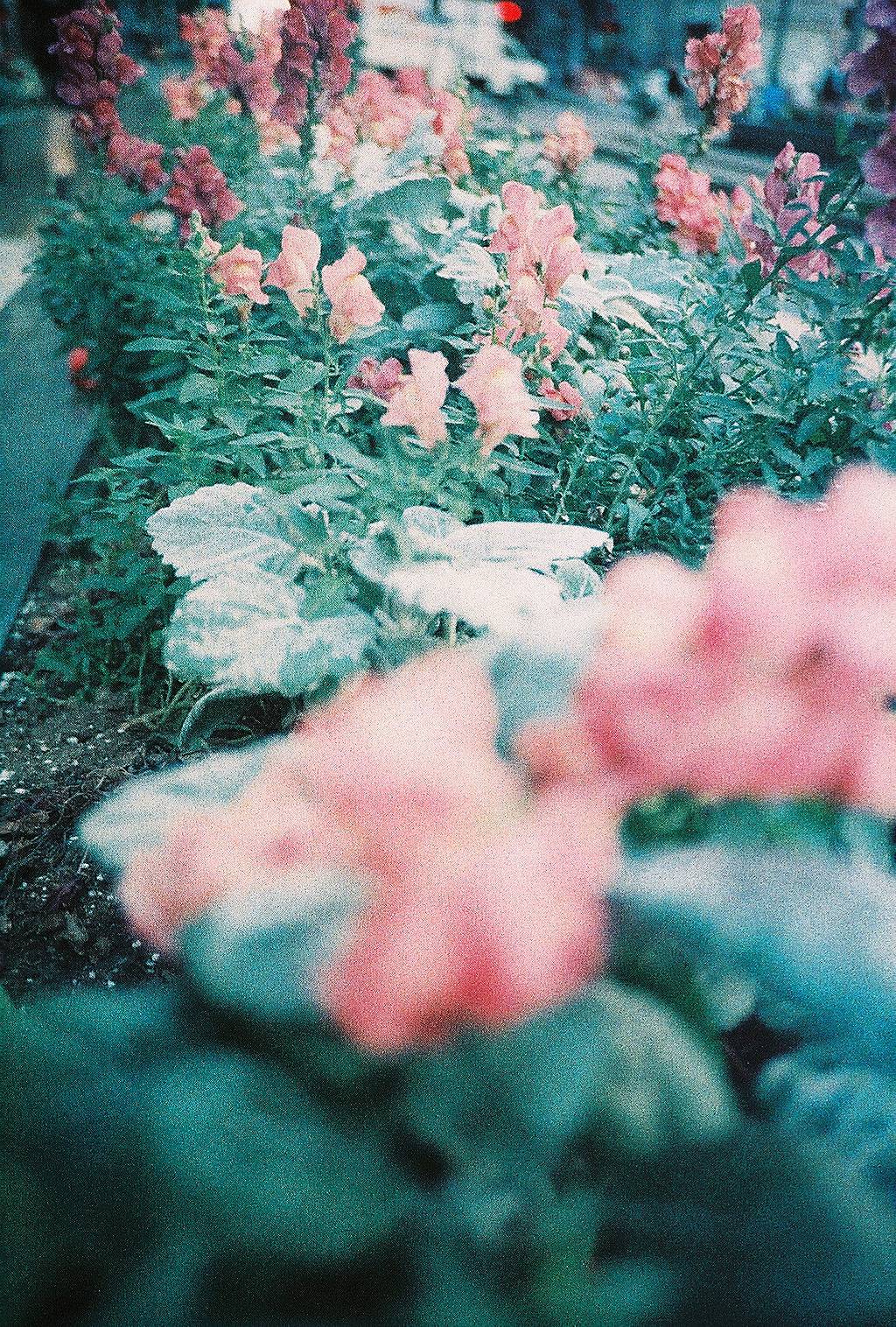
I took my first roll to Houston with me over Spring Break. Our ceramics department funds a trip for us every year to the NCECA, the National Ceramics Conference. This year it was in Houston and it was supposed to be beautiful, which it was. I decided that I wanted to bring a film that might match the weather, and what better than a super grainy, vintage looking film like Adox Color Implosion?


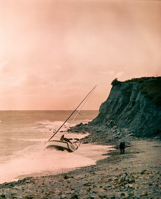
I immediately started snapping photos as soon as we landed, to the annoyance of a couple of my friends featured above. I found that this film can be quite remarkable when it comes to portraits and keeping skin tone looking natural.


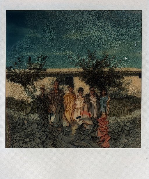
I even tested out a couple doubles which really bring out the grain of the film and have a certain luminescence that I really enjoy.


My favorite part has to be the punch that this film packs when it comes to blues. It’s beautiful and with its ISO of 100, this film is absolutely unstoppable and perfect for sunny days. It seems to fair pretty well indoors as well, but is much more suited for outside exposures. I would definitely recommend using Adox Color Implosion in the spring and summer.
I would also love to see fall photos in this film, because it’s supposed to make reds really vibrant. If anybody has tested it out already, I’d love to see!
written by edenhovenga on 2013-04-24 #gear #review #color-negative #grain #vintage #35-mm #user-review


4 Comments